Trading strategies can be classified into two broad categories:
Systematic Trading
Systematic trading involves adhering to a predefined set of rules or algorithms to execute trades. These rules are usually based on historical data analysis and quantitative modelling. The advantage of these systems is that you can provably verify your hypothesis / system on real-world data using back-testing / forward-testing and obtain quantifiable metrics to evaluate and build trust in your algorithm. It is dependable.
Caution
It is however very important to note that such an algorithmic system is usually NOT one that can self sustain unmonitored. Essentially, having an algorithmic system in place does not mean that the trader employing the strategy can just expect it to work in all markets and leave it unmonitored. Some systems might work very well in bull markets and work very poorly in ranging markets. It is important to identify the right situations to use the right model and have sufficient risk management policies in place to protect against any catastrophic failures. There are very few systems which work on all types of markets. Focus on a portfolio of strategies; no single strategy will save you. Your strategy will stop working at some point. Don’t grow attached; it won’t feel anything when it loses you money.
It is also important to note that even in algorithmic trading, a strategy is only as good as your discipline to follow it. Many algorithmic traders have made large losses due to changing their strategy when it was live before ample testing and not trusting their own back-tested data. You must have belief in your system and not make discretionary choices.
Discretionary System
Discretionary trading, on the other hand, relies on the trader’s judgement, intuition, and subjective interpretation of the market conditions to make trading decisions. Discretionary trading is subject to heavy emotional bias and they only have their own experience, market knowledge and instinct to make trading decisions on. Most retail investors do discretionary trading. This is not advised unless you are extremely experienced in the field and have a lot of experience and intuition to rely on when making trading decisions. A common form of professional discretionary trading is Scalp Trading. The primary disadvantage here being that as a human you are extremely susceptible to your decisions being swayed by news, social media and other such irrelevant factors negatively affecting your ability to making better trading decisions.
Trading System
A system in trading refers to a structured framework of rules that guides the trader in making decisions regarding when to enter and exit positions in the market. These rules are developed through market analysis and optimization to maximize profit potential while minimizing risk. To test whether a system is effective or not we back-test it on old data. Back-testing is the backbone of creating your system. After this, we can also forward test the model on live data to further build confidence.
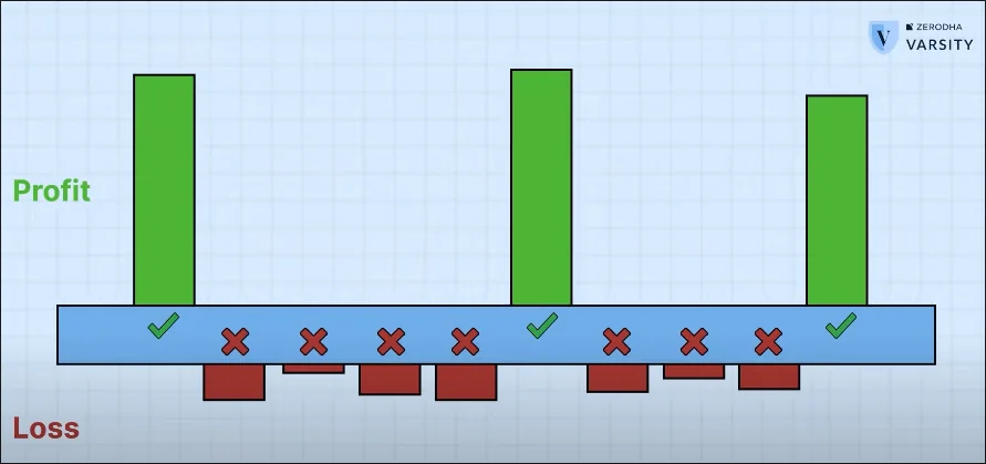
Good systems generally have a very small difference between the profit and loss percentage, but that small margin is enough to make big profits because in any good system when you earn, you earn big and when you lose you lose small, so effectively you end up with a pretty high profit. - Basics of Stock Trading - Honestly by Tanmay Bhat
The idea here is that we step strict stop losses. This might increase our loss percentage overall but it ensures that we can set a strict upper limit on our max loss even before we enter any trade. We trade some wins for the security of limiting our loss amount in the losing trades. And with a good system we should ensure that the money we gain in winning trades is much higher than the losses realized in losing trades. One trick to handle both greed and risk in winning trades is to incorporate a trailing stop-loss.
Trailing Stop-Loss
The idea is pretty simple. Let’s say our stop loss on some trade is 10% from entry and now let’s say the stock has gained 10% profit. We can then dynamically move the stop loss to the entry point. This way we can greedily stick with the trade in hopes of getting more profit while ensuring that the maximum possible loss on the trade is 0%. Similarly if we get to 20% profit we can move the stop loss to 10% and so on. We greedily increase the stop loss by some function while sticking with the trade.
How to Make a System
To make a system we need to learn technical analysis. Technical analysis is essentially a fancy term for “finding patterns in charts and price-volume data and using that to predict price movements.” In theory, technical analysis is bullshit. The stock market (What is the Stock Market?) is just a market for companies to request investment from speculative investors and the stock price is supposed to be reflective of the company’s earnings and growth in that period. It should theoretically not be possible to obtain this number simply from reading candlestick chart patterns. But the arguments given for technical analysis are as follows:
Large fundamental analysis firms, who control most of the stock price movements (since they’re the massive institutional investors) do their research well in advance and they are far more accurate than the research an average retail investor can afford to conduct. As a consequence, they are likely to take decisions long before indicators that retail investors use for investment come out. Essentially, the stock price should’ve already corrected for the negative/positive news or earnings report that might be released to the public later as we can trust these large institutional investors to have done their due diligence well in advance. When an institutional investor makes a large volume trade on the market, it is often broken down into smaller trades over a longer period of time, and it is these patterns that technical analysis hopes to find. Essentially indicators of institutional investors investing and trusting their well-funded research over your own.
As someone once said, “Technical analysis works because other people believe in technical analysis.” If we model the stock market as a game that we are designing an algorithm to win money in, our algorithm which follows some strategy $A$ will always have a counter strategy $A'$ that it will lose a lot of money to. Because there are so many players with large amounts of money playing this “game”, it is often possible to design a strategy that beats the strategy of other investors and hence, technical analysis is able to make profit.
How to Do Technical Analysis?
Technical analysis is the study of price movement.
Recognition of Patterns: Technical analysis operates on the premise that historical price patterns tend to repeat themselves due to recurring human emotions such as greed and fear. Patterns can also indicate institutional investment as mentioned previously. These patterns manifest as identifiable trends in the market.
Emphasis on Price: Contrary to fundamental analysis, which considers external factors such as news and economic indicators, technical analysis prioritizes price action. The price reflects all available information, making it a reliable indicator of market sentiment and future price movements. Stems from THE EFFICIENT MARKET HYPOTHESIS. Slightly paradoxical.
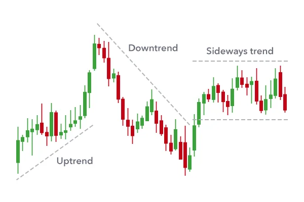
Trends
Uptrend → Higher lows
Downtrend → Lower highs
Sideways → Consistent highs and lows around the same value
Don’t follow the news, follow the price. Retailers and institutional investors involved in the market, who do fundamental analysis have done far more research than you could hope to do and have good deductions about the condition of the market say even, 6 months down the line. This is not something that is feasible for us to do. However, based on these deductions, big groups of retailers starts buying/selling stocks and this will be reflected in the price. The news always follows the market. The news finds should’ve already been reflected and accounted for in the stock price.
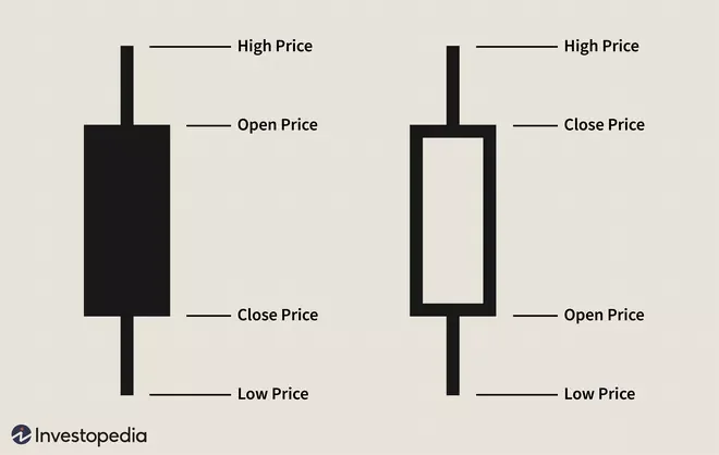
Candlestick Charts
The solid body of the candlestick represents the price range between the open and close of that day’s trading. When the real body is filled in black / red then the close was lower than the open. When it is not filled in / filled in green then the close was higher than the open. The two “wicks” on either end represent the highest / lowest price at which the stock was traded for on that day.
Time-Frames
Choosing different time-frames can greatly alter the granularity at which data is visualized and can show varying trends. Shorter time-frames, like hourly or even minute-by-minute charts, provide detailed insights into intraday price fluctuations. Conversely, longer time-frames, such as weekly or monthly charts, smooth out noise and highlight broader trends, making them useful for identifying significant market movements and potential long-term patterns. Patterns in larger scale time-frames are often an indication that there is a lot of money behind it. This is interesting because when a lot of money is invested, it is very likely to be backed by big institutional investment. In weekly time-frames, the open is the open of the market on Monday morning and close is the close on Friday end.
Todo: Support & Resistance
Indicators
Moving Average (Ma)
An $n$ day moving average is a single number used to obtain the average of a financial instrument’s price over the last $n$ days. Computing the moving average over several days just be thought of sliding a window containing the terms we’re averaging along the time axis. It’s essentially a constantly updated average price.
$$
\begin{aligned}
\text{MA} = \frac{1}{N} \sum_{i=0}^{N-1} P_{i} \\
\end{aligned}
\begin{aligned}
\quad \quad \quad
&MA \text{ is the Moving Average} \\
&N \text{ is the number of time periods used to calculate the } MA \\
&P \text{ is the representative price of the stock at time period } i \\
\end{aligned}
$$
The moving average can be thought of as a more smoothed-out representation of all the noise and fluctuations inherent to a stock’s price movement at shorter timescales. Also note, the moving average is a trend-following or lagging indicator. This is because it is based on past prices and is not dependent on future prices.
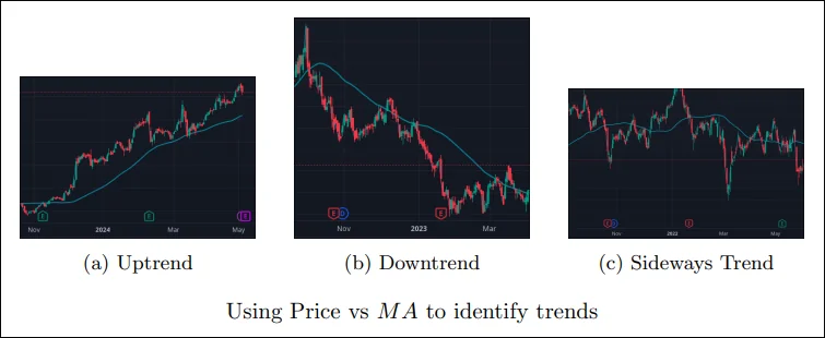
Use Case #1: Identifying Trends
Moving averages are very useful visual indicators to identify the general trend of stock movements. There’s multiple ways you can use the $MA$ to judge trends.
Price vs Ma
If the price is consistently and currently above the moving average line, then you can consider it an uptrend and should look for buying opportunities. On the other hand, if the price is consistently below, then it’s a downtrend and you should look for exit opportunities.
As can be seen with the sideways ranging markets, it’s important to wait for a consistent showing of price above or below the trend line before categorizing a stock to be in an upward or downward trend.
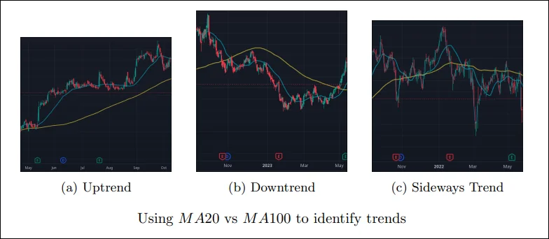
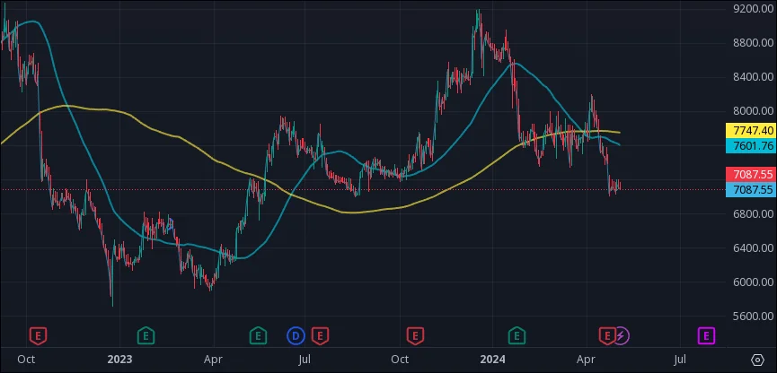
Using Two Moving Averages
We can also use 2 MA’s to identify trends. For example, the 20 MA is a short term moving average which gives you the short term trend of the market. And the 200 MA is a long term moving average which gives you the long term trend of the market. If we just used the 20 MA, the few times the price negatively crossed the 20 MA might have been identified as possible sell opportunities. But comparing it with the 200 MA, we can tell that the price is still in an overall uptrend and hence conclude that selling in those short term dip periods is risky.
“Using two moving averages will not provide you with better trades. But it will help you avoid bad trades.”
When working with moving averages, it is very important to understand that moving averages should not be used as a buy or sell signal, but primarily as a confirmatory indicator to ensure that we aren’t entering a bad trade against the trend when using trend based strategies. As you might note from the above figures, the moving average strategy works exceedingly terribly in sideways ranging markets and will often flip continuously between short-term buy / sell opportunities. A trader acting on these impulses in a sideways ranging market is likely to make loss. It is hence imperative to note that this strategy works only in trending markets. As mentioned before, it is very important to be able to decide when to employ what strategy.
Use Case #2: Identifying Trend Reversals
This idea is extremely similar to the idea of using two moving averages. Say we use the 50 MA and 200 MA, we always want a smaller and a larger MA. The cross over points of these lines could often signify potential trend reversals in the market. This is one of the most commonly used / beginners ’learn-indicators’ introduction to the stock market. In practice, do not place trades at these reversals, but use these signals along with other factors to make better trade decisions.
Use Case #3: Identifying Dynamic Support and Resistance
When talking about support and resistance, we usually talk about a fixed price level at which we expect the price to reverse and bounce back and forth between. However, these ‘fixed’ levels are often not fixed, especially in trending markets.
In these situations it makes a lot of sense to also use the moving average lines as a dynamic moving set of support and resistance points. You can then (in an uptrend) choose to buy close to the MA line. Similarly in a downtrend, you can identify selling opportunities when the stock price is close to the MA line.
Conclusion
In short, this indicator works relatively well only in trending markets. It is hence imperative to use it only in markets that you can clearly classify as trending. Some pros include that the indicator is very simple and easy to build or incorporate into strategies. There are clear entry OR exit points. Primary disadvantage is requiring to be able to identify a market as being trending or sideways ranging. Further, you also don’t have any easy way to identify target take profits using just this indicator. Another possible pro with this indicator is that in practice, you are likely to misclassify several entry / exit points and take several short term minor losses, but the few times when the trend following strategy works, you are likely to enter in long term investments that generate a lot of profit.
The moving average shines best when trading on less-volatile stocks like the NIFTY and other index / large-cap stocks on large time-frames (weekly / monthly).
Exponential Moving Average (Ema)
The exponential moving average is similar to a moving average, but works on the idea that recent prices should be given more weight than older prices in the average. For example, a large volume move on a single day (due to either institutional trading or world events) would be better captured in an EMA than a MA. Hence it is more suited to acting as a crossover in the crossover strategy for more volatile stocks or for shorter time frame swing trading.
$$
\begin{aligned}
EMA_t = \Big [ P_t \times \Big(\frac{s}{d+1}\Big) \Big] + EMA_{t-1} \times \Big[ 1 - \Big(\frac{s}{d+1}\Big) \Big]\\
\end{aligned}
\begin{aligned}
\quad \quad
&EMA_t \text{ is the EMA at time period } t \\
&P_t \text{ is the representative price of the stock at time period } t \\
&s \text{ is the smoothing factor } \\
&d \text{ is the number of time periods } \\
\end{aligned}
$$
Essentially, the quantity $\frac{s}{d+1}$ is the constant factor (or multiplier) used for smoothing and calculating the EMA. If we look at how the terms are expanded,
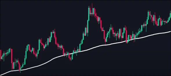
For a 20-day moving average with $s = 2$, the factor $\alpha$ would be around $0.0952$. The below diagram represents the difference between using the MA and the EMA to study stock trend movements.
In the figure below, the number of periods used in each average is 15, but the EMA responds more quickly to the changing prices than the SMA. The EMA has a higher value when the price is rising than the SMA and it falls faster than the SMA when the price is declining. This responsiveness to price changes is the main reason why some traders prefer to use the EMA over the SMA.
In short, the EMA is a more responsive indicator than the MA. The whole idea with a MA was to smooth out the volatility in daily price changes over larger time-frames. However, when working with more volatile stocks / shorter time periods it might make sense to consult the EMA instead. It is also especially useful to detect trend reversals using the crossover strategy faster. It is one of the most famous known strategies used, similar to the MA crossover.
Moving Average Convergence Divergence (Macd)
The Moving Average Convergence Divergence (MACD) is a technical analysis tool utilized by traders to gauge the relationship between two exponential moving averages (EMAs) of an asset’s price. It helps in identifying potential trend reversals, momentum shifts, and confirming the strength of a trend. The MACD is calculated by subtracting the 26-day EMA from the 12-day EMA:
The MACD line is then smoothed by calculating a 9-day EMA, known as the signal line:
$$
\text{Signal Line}=\text{9-day EMA of MACD}
$$
This signal line assists in identifying potential buy or sell signals and to confirm the strength of a trend. Also, since MACD uses just EMAs, it is also a lagging indicator.
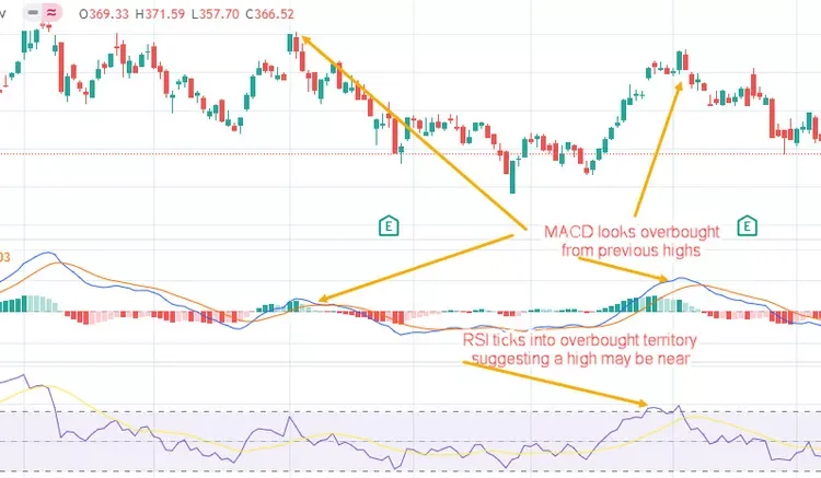
The MACD lines, however, do not have concrete overbought/oversold levels like the RSI and other oscillator studies. Rather, they function on a relative basis. An investor or trader should focus on the level and direction of the MACD/signal lines compared with preceding price movements in the security at hand, as shown below.
MACD measures the relationship between two EMAs, while the RSI measures price change to recent price highs and lows. Both measure momentum in a market, but because they measure different factors, they sometimes give contrary results. The RSI may show a reading above 70 (overbought) for a sustained period, indicating a market is overextended to the buy side of recent prices. In contrast, the MACD indicates that the market is still increasing in buying momentum. Either indicator may signal an upcoming trend change by showing divergence from price (price continues higher while the indicator turns lower, or vice versa).
The most common use of this indicator it to identify buy / sell signals using the crossover of the MACD and Signal lines. Let’s first try to understand what the MACD terms signify. If the MACD value is positive, it implies that the short-term average (12-day EMA) is above the long-term average (26-day EMA). As discussed in the explanations of EMA and MA above, this implies that in the short term, there is an upward momentum in the price and signals a likely uptrend. Similarly, negative MACD values signal likely downward momentum. Now, we can use the MACD line as a sort of indicator of short term price trends. Combining this with the signal line, if we see the 9-day EMA of the MACD crossover with the MACD line, when the MACD is also below the 0-line, it implies that the trend until now was a downtrend (since MACD was below 0), and the crossover with the signal line (which is the EMA of the MACD) implies that there was sudden reversal and upward momentum. Hence it is a very useful indicator to identify swing trading opportunities in the short-term. This is also a very popular strategy.
The green line on top of the price movement chart is the 50-day MA, the yellow line is the 200-day MA and at the bottom, the blue line is the MACD indicator and the orange line is the signal line. The histogram represents the difference between the signal and the MACD, serving as a measure of strength of the trend. It is also centered on the 0 line.
Use Case #2: Confirming Trend Strength
You can also use the difference / gap between the MACD line and the signal line as an identification of trend strength. A large gap implies a fast upward momentum push, whereas a smaller gap would imply a weakening trend that is losing steam. However, you should note that often when this happens, it implies that the underlying financial security is probably overbought or oversold and might soon pull back to normal levels. You can combine this analysis with the RSI to verify such conditions.
Use Case #3: Macd Divergence
When MACD forms highs or lows that exceed the corresponding highs and lows on the price, it is called a divergence. A bullish divergence appears when MACD forms two rising lows that correspond with two falling lows on the price. This is a valid bullish signal when the long-term trend is still positive. Some traders will look for bullish divergences even when the long-term trend is negative because they can signal a change in the trend, although this technique is less reliable.
When MACD forms a series of two falling highs that correspond with two rising highs on the price, a bearish divergence has been formed. A bearish divergence that appears during a long-term bearish trend is considered confirmation that the trend is likely to continue. Some traders will watch for bearish divergences during long-term bullish trends because they can signal weakness in the trend. However, it is not as reliable as a bearish divergence during a bearish trend.
MACD is a very versatile indicator that attempts to compress all the info you could get from MAs / EMAs into a single, easy to use, user-friendly indicator. This is also one of the reasons why it’s very popular among those just getting into trading. Since it relies completely on EMAs, it has the same advantages / disadvantages as the MA strategies. It works very well in trending markets and will definitely help avoid bad trades that rely on trends, however, it will do poorly in ranging sideways markets. MACD is best used with daily periods, where the traditional settings of 26/12/9 days is the default.
Relative Strength Index (Rsi)
The RSI is a momentum indicator that was developed by J. Welles Wilder Jr. and introduced in his 1978 book, New Concepts in Technical Trading Systems. The RSI was developed as an indicator that is able to judge the strength on days when prices go up to its strength on days when prices go down. It is used in strategies often to check when a stock is overbought or oversold.
The RSI uses a two-part calculation that starts with the following formula:
$$
\begin{aligned}
RSI_{\text{step one}} = 100 - \Big[ \frac{100}{1 + \frac{\text{Average Gain}}{\text{Average Loss}}}\Big]
\end{aligned}
\quad
\begin{aligned}
\text{The average gain or loss used in this calculation is the average percentage} \\ \text{gain or loss during a look-back period.} \\ \text{The formula uses a positive value for the average loss.} \\ \text{Periods with price losses are counted as zero in the calculations of average gain.} \\ \text{Periods with price increases are counted as zero in the calculations of average loss.}
\end{aligned}
$$
The standard number of periods used to calculate the initial RSI value is 14. For example, imagine the market closed higher seven out of the past 14 days with an initial average gain of 1%. The remaining seven days all closed lower with an initial average loss of −0.8%. The first calculation for the RSI would look like the following expanded calculation:
Once there are 14 periods of data available, the second calculation can be done. Its purpose is to smooth the results so that the RSI only nears 100 or zero in a strongly trending market.
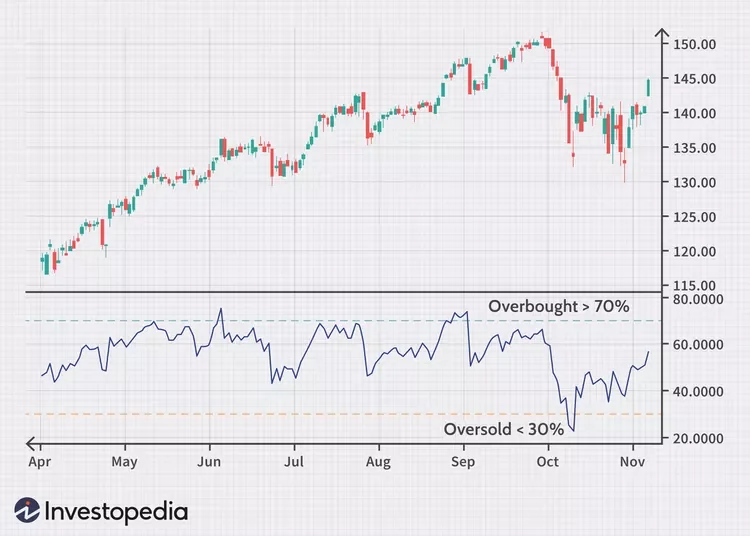
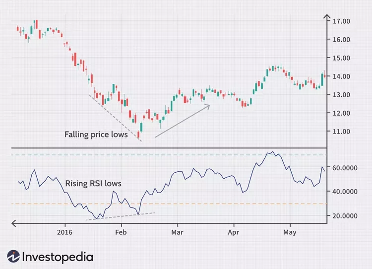
Let’s start by clearing a common misconception. The RSI crossing a value of 70 does imply that it is overbought, but that does not imply that it cannot stay overbought for long periods of time. The below image is a clear example of this:
Similarly, it can also remain oversold for long periods of time. The RSI is a momentum indicator. So if it is overbought, that implies that the momentum is to the upside. It should not be used as a reversal indicator.
Use Case #1: Trend Strength
During trends, the RSI should frequently stay near the upper band of 70. Similarly during a downtrend, it is likely to frequently hover around 30. For example, if the RSI can’t reach 70 on a number of consecutive price swings during an uptrend, but then drops below 30, the trend has weakened and could be reversing lower.
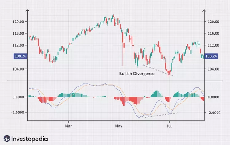
Use Case #2: Rsi Divergence
An RSI divergence occurs when price moves in the opposite direction of the RSI. In other words, a chart might display a change in momentum before a corresponding change in price. A bullish divergence occurs when the RSI displays an oversold reading followed by a higher low that appears with lower lows in the price. This may indicate rising bullish momentum, and a break above oversold territory could be used to trigger a new long position. A bearish divergence occurs when the RSI creates an overbought reading followed by a lower high that appears with higher highs on the price.
As you can see in the following chart, a bullish divergence was identified when the RSI formed higher lows as the price formed lower lows. This was a valid signal, but divergences can be rare when a stock is in a stable long-term trend. Using flexible oversold or overbought readings will help identify more potential signals.
Similar to MACD, RSI is also a momentum indicator that works well in trending markets. There is a common misconception among new traders that RSI crossing 70 / 30 mark is a reversal indicator. This is not true, the RSI simply measures the relative strength in gains to the relative strength of losses. In an uptrend for example, you would expect the RSI to constantly be very high as the relative gains must be higher than the relative losses in an uptrend. Hence we should instead use it as a confirmation for determining trends. Similar to MACD and EMA, the RSI will also do poorly in ranging markets as we would expect the relative strength of gains and losses to be roughly equal with a few random spikes here and there.
Lorentzian Classifier
A Lorentzian Distance Classifier (LDC) is a Machine Learning classification algorithm capable of categorizing historical data from a multi-dimensional feature space. This indicator demonstrates how Lorentzian Classification can also be used to predict the direction of future price movements when used as the distance metric for a novel implementation of an Approximate Nearest Neighbors (ANN) algorithm.
In physics, Lorentzian space is well-known for its role in Einstein’s General Relativity, describing the curvature of space-time. Interestingly, this abstract concept has practical applications in trading. Recent studies suggest Lorentzian space’s suitability for analyzing time-series data. Empirical evidence shows that Lorentzian distance handles outliers and noise better than Euclidean distance and outperforms other distance metrics like Manhattan distance, Bhattacharyya similarity, and Cosine similarity. It consistently yields higher mean accuracy across various time series datasets compared to other metrics, except for Dynamic Time Warping approaches, which are too computationally demanding for current PineScript capabilities.
Euclidean distance is commonly used as the default distance metric for NN-based search algorithms, but it may not always be the best choice when dealing with financial market data. This is because financial market data can be significantly impacted by proximity to major world events such as FOMC Meetings and Black Swan events. This event-based distortion of market data can be framed as similar to the gravitational warping caused by a massive object on the space-time continuum. For financial markets, the analogous continuum that experiences warping can be referred to as “price-time”.
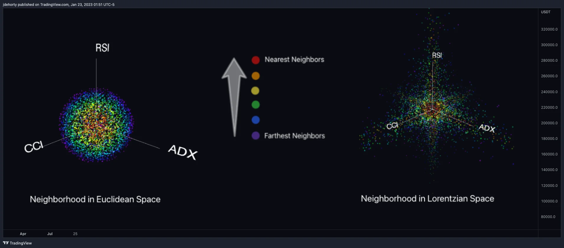
Below is a side-by-side comparison of how neighborhoods of similar historical points appear in three-dimensional Euclidean Space and Lorentzian Space:
This figure demonstrates how Lorentzian space can better accommodate the warping of price-time since the Lorentzian distance function compresses the Euclidean neighborhood in such a way that the new neighborhood distribution in Lorentzian space tends to cluster around each of the major feature axes in addition to the origin itself. This means that, even though some nearest neighbors will be the same regardless of the distance metric used, Lorentzian space will also allow for the consideration of historical points that would otherwise never be considered with a Euclidean distance metric.
Intuitively, the advantage inherent in the Lorentzian distance metric makes sense. For example, it is logical that the price action that occurs in the hours after Chairman Powell finishes delivering a speech would resemble at least some of the previous times when he finished delivering a speech. This may be true regardless of other factors, such as whether or not the market was overbought or oversold at the time or if the macro conditions were more bullish or bearish overall. These historical reference points are extremely valuable for predictive models, yet the Euclidean distance metric would miss these neighbors entirely, often in favor of irrelevant data points from the day before the event. By using Lorentzian distance as a metric, the ML model is instead able to consider the warping of price-time caused by the event and, ultimately, transcend the temporal bias imposed on it by the time series.